
Open Social Summit
Galaxia: improving the platform one component at a time
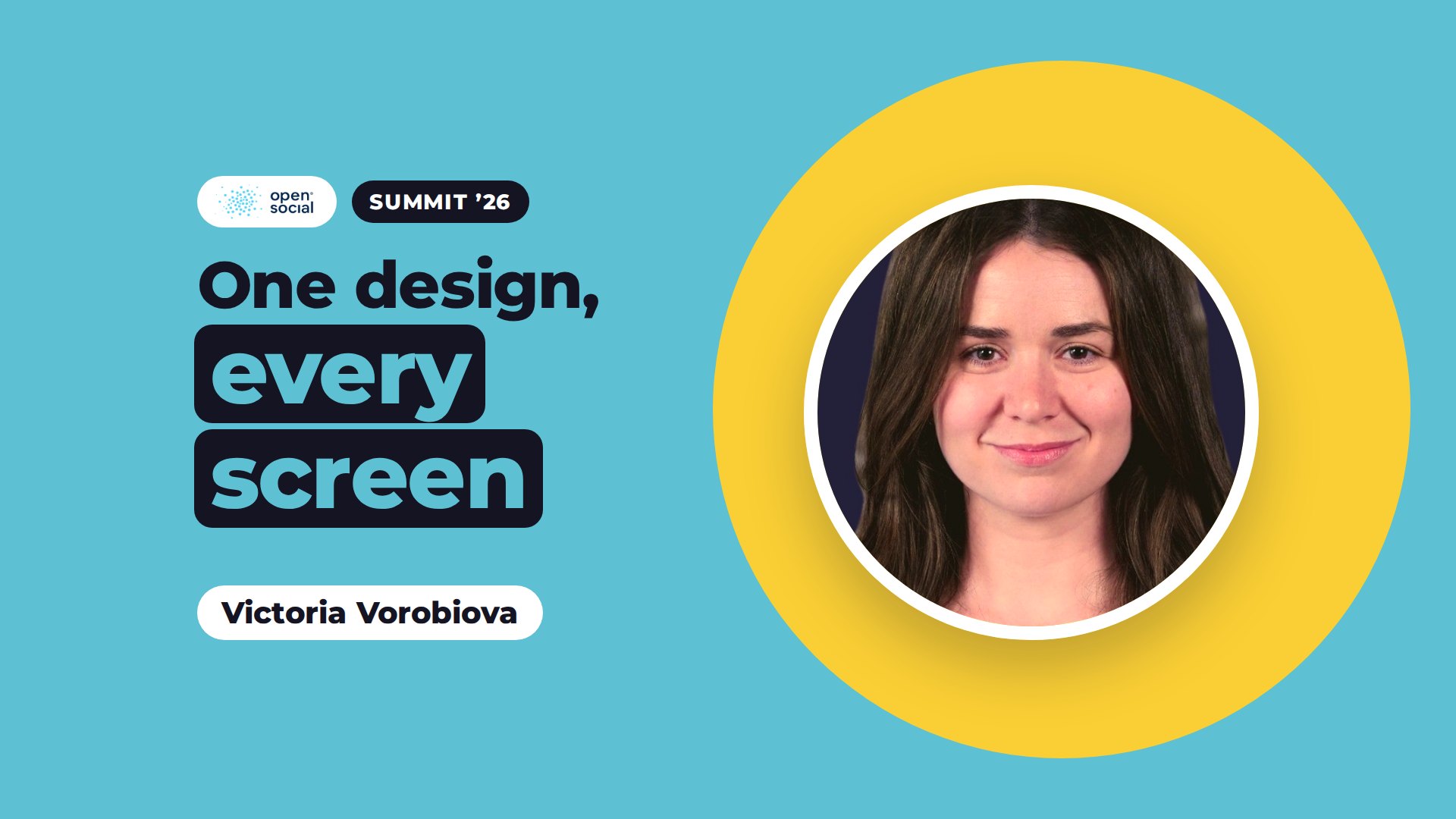
How Open Social's design system improves the interface step by step, with accessibility built in and users testing every change first.
At the Open Social Summit '26, Victoria Vorobiova, design lead, presented Galaxia, Open Social's new design system, and the concrete improvements it will bring over the coming months.
Why a design system
Over the years, the Open Social interface has grown through many good additions, each solving a real need. The result is a set of pages that can be improved as a whole. On many event pages, for example, a large image comes first and the date and sign up details only appear after scrolling. On group pages, the title sits on top of the header image, so readability depends on the photo.
Galaxia is a shared library of components, from buttons and links to navigation and content cards, with common rules for colour, typography and spacing. Every interface change is now built from it, and accessibility is a requirement for every component.
One component at a time
Rather than a single large redesign, Galaxia improves the interface step by step. Victoria mapped around a hundred components across the product and scored each on impact, how much users see and use it, and feasibility, how well and how soon it can be delivered. The work follows that order.
The first component, the new top navigation, is now live on most platforms. It behaves as before, so users do not need to relearn anything. It uses each community's own brand colours without changes to settings, and it works on mobile, is easy accessible with a keyboard and with screen readers.
What comes next
- Group headers: image and text are separated, so titles are always readable, and images keep a fixed ratio. The location becomes a link to other groups in the same place.
- Navigation within groups and content: navigation stays in the menu, and management actions such as membership requests move behind one edit button. When you scroll, the menu becomes a compact bar so you keep your bearings.
- Content cards: a clearer layout for events, topics and groups in lists, so each type is recognisable at a glance.
- Event and content pages: the key information and actions, including date, visibility and add to calendar, come first, with the image alongside.
Each of these adds components, such as links, dates and visibility labels, that then work the same way across the whole platform.
Users test first
Every component follows the same cycle: research, design, testing with users, development, documentation, release and a further round of feedback. Clients will be invited to try new designs in a test environment, which takes ten to fifteen minutes. Feedback at the Summit is already shaping the work, including placing text on the left and images on the right, and making action buttons larger and easier to use.
A design system also prepares the product for designing with AI. When pages are assembled from proven components, designers can spend more of their time with users, understanding the problems worth solving.
See it for yourself
If you run a network of organisations and want to see how this works in practice, request a demo.
Related articles
You might find this interesting too.

Connect. Collaborate. Thrive.