Discover the world's only
Community Collaboration Platform
Our 6 products together form your unique platform. Schedule a demo for a personal consult.
What is a Community Collaboration Platform?
Our platform is a comprehensive software solution designed to elevate the way organizations connect, engage and collaborate within their communities. Unlike traditional community software, our platform goes beyond basic functions to offer a holistic approach towards member collaboration. And unlike intranet or team focused tools we support complex multi-layered organizational structures.
Our platform consists of multiple products, such as our Community Management System (CMS), Cloud Hosting, Gaia AI, Engagement Studio, Lumina Insights and more, into one unified platform.
The goal of our platform is to deliver an exceptional and delightful user experience along the entire member journey.
Discover Open Social's
Community Collaboration Platform
Rethink engagement models and member journeys, and explore the benefits our experience platform offers.

Discover our user-first design philosophy
Intuitive user-interfaces drive onboarding and engagement

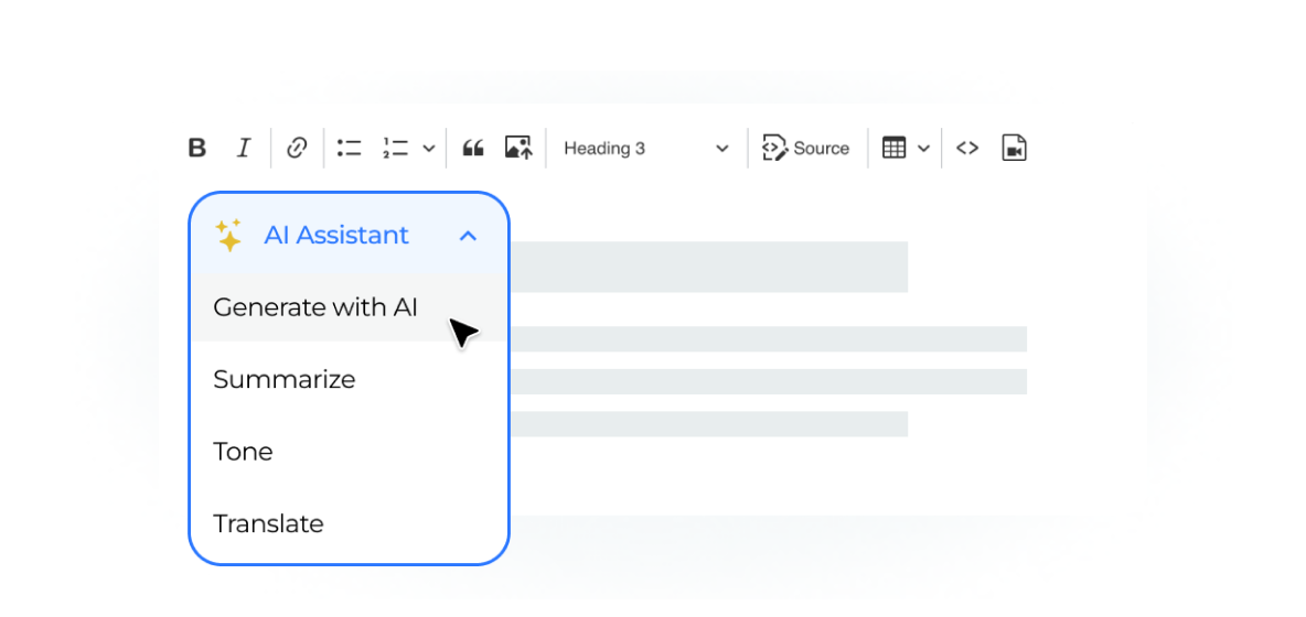
Revolutionize knowledge interaction with our Gaia AI

Built enterprise-ready networks for a global audience
Trusted by the world’s most ambitious organizations


Client cases
Open Social's impact

Josh Goodman
Business Owner


Margaret Peterson
CEO

Intuitive interface built for your community

Connect. Collaborate. Thrive.